Page 1 of 2
Magpie's Fliers (image heavy)

Posted:
Tue Mar 06, 2007 5:17 pmby Magpie Saegar
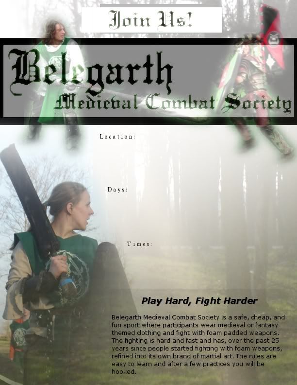
Okay... On a whim I decided to make some fliers.... I've only made two so far, and both are pretty rough.
SO.... I'm posting them here to get feedback. Tell me what you like, what you don't like, and what you think I need to do for these to be more useful. Then I'll try to do what you say and make more.
The ones I have so far are more "artsy" of fliers. I think I need to add more text (any ideas of what?), multiple sharper photos, and more distinct formatting.
Oh, and by the way. Anyone who wants to can use / edit any of these. I took all the photos myself. If you're just using them to advertise your practices, there's no need to credit me. I'd love to know, cause it'd make me happy. But whatever.
[edit: linked instead of shown, cause it's a bad first try.. bad photo... no info...]
http://i75.photobucket.com/albums/i293/ ... /BMCS2.jpg
[edit: linked instead of shown, not enough info... too hard to read]
http://i75.photobucket.com/albums/i293/ ... /BMCS4.jpg
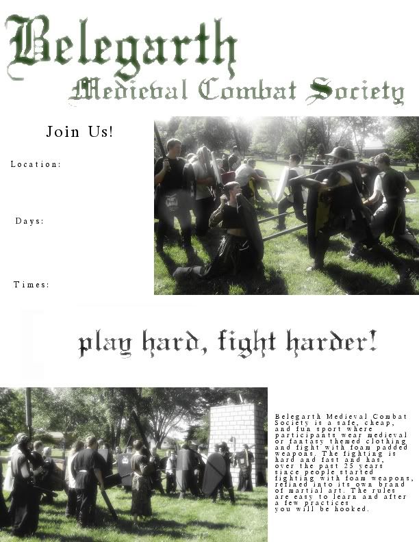
[edit: linked instead of shown. too much white space]
http://i75.photobucket.com/albums/i293/ ... /BMCS3.jpg
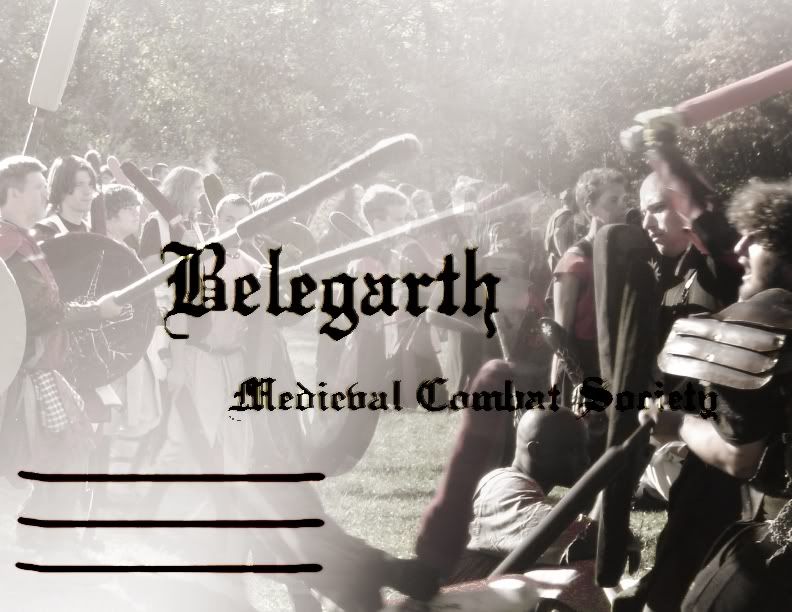
[edit: fourth try added. It needs the website address, and maybe a combat pic]
[edit: I replaced the word "posters" with the word "fliers" whereever I wrote it.]
Posted:
Tue Mar 06, 2007 6:55 pmby To'Gur
those are great
Posted:
Tue Mar 06, 2007 7:03 pmby Magpie Saegar
Thanks!
What's missing / bad / not enough / improvable / confusing / distracting / annoying about them?
Or, specifically as possible, what do you think is working for them?
Posted:
Tue Mar 06, 2007 7:09 pmby debuenzo
well you need the details lines/ sections....that's good
the pictures are cool too....
all in all i think it's good
maybe a line about meeting fun/ energetic / friendly people
getting excercise while living medieval fantasy
stuff like that....
Posted:
Tue Mar 06, 2007 7:13 pmby Atman
The second poster down is a bit lacking in text contrast. It might help to give the text a narrow white outline.
Posted:
Tue Mar 06, 2007 7:28 pmby Magpie Saegar
Good points so far...... I'll try to keep those in mind...
[Edit: fourth try added on top.]
oh! I meant to add the website on there too....
Posted:
Tue Mar 06, 2007 7:30 pmby To'Gur
very well done magpie
Posted:
Tue Mar 06, 2007 8:00 pmby Magpie Saegar
I think they, including that last one, look nice... but I don't feel like it shows enough combat. Does it need to? Hmmm... I don't know what piques people's interests.
Posted:
Tue Mar 06, 2007 9:20 pmby Jynkz
Last one looks the best imo. But, I would get rid of the top left picture and add a more dressed up person like on the right with v`hil just personal preference. Also, nice job on adding a cute girl that will draw a couple people in for awhile atleast =P
Posted:
Tue Mar 06, 2007 9:58 pmby Kensman Bam
I like these a lot Magpie!! Good stuff!
I do have a question though, what did you use to make these? And is it possible to get a soft copy of the original so it can be modified with pics from our own realm?
Posted:
Tue Mar 06, 2007 10:51 pmby A Pimp Named Kabibbles
I like the second two alot more then the first two. I think the good action shots are the most attractive to people. the first one just looks like people gathering their wepons after a battle and the second one is just before the good stuff is about to start up.
you cant read the word society in the second one very well.
But still Great job on them!
Posted:
Tue Mar 06, 2007 11:19 pmby Magpie Saegar
I used "The Gimp Image Editor" to make all of these. It's like photoshop... but it's freeware. So you should be able to download for free somewhere. I have linux, so it was really handy to get.
I'd agree that I also like the latter two more, and the last one most. The first one is kinda... not much going on. The second one looks cool, in my opinion, but is not as functional as it could be. The third one has nice pictures, but could be put together better. The fourth one is the best so far, I agree....
As far as getting templates, I could try that. I'll start from scratch to try producing whatever you want... with your pictures, or with empty squares. Just ask. These didn't take very much effort (and it shows), just a little time.
Posted:
Wed Mar 07, 2007 1:31 amby Big King Jimmy
I've never liked how drago looks in the second pic.... I just think he looks like he's REALLY gone crazy. Like bad crazy.
I don't like the lighting in the third fliers pics.
The first and second need more text, but I think that's been mentioned.
The fourth looks the best imo, I'd leave it exactly how it is.
Posted:
Wed Mar 07, 2007 2:25 amby Brooder
I really like the "fog of war" effect on the first flier.
I like the second one.
I agree with Jim, the lighting effect in the thrid flier is not good. But they are good action pictures.
The fourth one is my personal favorite, although I think there should be a picture of a battle on it.
Overall, good job Magpie!
Posted:
Wed Mar 07, 2007 9:16 amby Atman
That last one's definitely a keeper.
It might be a good idea to add the website (either Belegarth or the realm being advertised) onto the posters so people have a way to learn more about Bel. without having to go to a practice.
Posted:
Wed Mar 07, 2007 9:36 amby savetuba
1st Crappy pic.
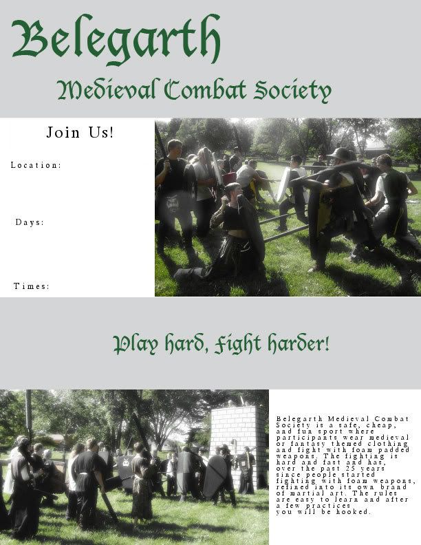
2nd Move the black title text to the top area above the heads, remove/lessen the fade, keep the info where it is and it will be good.
3rd different 2nd pic, less white space.
4th Gold. Not very B&W friendly though.
Posted:
Wed Mar 07, 2007 9:54 amby ICARUS
Savetuba- Don't be so harsh, man. At least he's trying to make some posters advice is good but watch how you say it.
Posted:
Wed Mar 07, 2007 10:06 amby savetuba
harsh? Not me

and tone is all in your mind. Though the word crappy kind of sets the tone doesn't it...But those are the facts as i see it. and most people have commented the same on a few of them.
Posted:
Wed Mar 07, 2007 10:14 amby Magpie Saegar
Nononononono, savetuba, that was good. I want people to be harsh. You were harsh... not offensive, but honest. That's how I'll get better. I don't want / need compliments, unless it's about some innovation I did well that I should make sure I continue to use.
Besides, looking back, I think I agree with everything he said.
Posted:
Wed Mar 07, 2007 10:24 amby savetuba
its like I tell my noobs, you will not learn anything if we go easy on you.
Posted:
Wed Mar 07, 2007 1:58 pmby Savage
magpie, those showed marked improvement one after another.
if you don't mind, i'm going to use the final draft to recruit this season in my area.
is that the full-sized image posted up there, or do you have a larger version you could e-mail me?
anyone have really good ideas of where these things could do the most work?
Posted:
Wed Mar 07, 2007 2:06 pmby To'Gur
strip joints and daycares
Posted:
Wed Mar 07, 2007 2:30 pmby savetuba
Savage wrote:anyone have really good ideas of where these things could do the most work?
Bulletin boards at churches, general stores (I know wal-mart has a huge board), game stores, comic stores, computer stores, skate board shops, paint-ball shops, post offices, libraries, police station, fire station, gas stations(if allowed), sides of communal mail boxes (ones with 50 little boxes in one metal box on the side of the street), apartment's notice boards, clubs, pubs, bars, schools (not elementary, may need to clear with admin of high schools), country club notice boards, newspaper's clubs and groups section, city's web site, malls, strip malls, sides of trash cans, park benches, on homeless people (bumvertising(c)), ect...
AVOID Transportation stations and any place close to major freeways in case some idiot thinks you are placing a bomb.
Posted:
Wed Mar 07, 2007 2:43 pmby Savage
xAlUcArDx wrote:strip joints and daycares
i meant aside from the obvious. duh.
Posted:
Wed Mar 07, 2007 2:59 pmby Squire Moxk
i have to say this one is defndantly my favorite
Posted:
Wed Mar 07, 2007 3:21 pmby savetuba
moxk wrote:i have to say this one is defndantly my favorite
For what reasons?
personally, the abundance of white **** with your eyes. It makes the pics look to hazy, or technically speaking, over exposed and the title text's edges look ****, or pixelized/over sharpened. Instead make the white a light grey and see how the image looks, hell I'll show you when I get home.
Posted:
Wed Mar 07, 2007 3:25 pmby To'Gur
maybe he just likes it... that could be a good reason
Posted:
Wed Mar 07, 2007 3:29 pmby savetuba
and if that is the reason then there is no need to fix it

, but from my personal and professional opinion, there is too much white.
Wrong font due to the other degrading to much when I tried switching the colors, however it is an example of what half the white can do for the poster.
Posted:
Wed Mar 07, 2007 3:32 pmby To'Gur
ya i see what you mean
Posted:
Wed Mar 07, 2007 11:24 pmby Magpie Saegar
That's a good point with the grey.
And yes, to savage or anyone, I do have a slightly larger version I can send you. Just pm me with your email address and a link to which one you want.... It's only slightly larger, so ... you could probably use this one too. Either way is fine. The larger version should be (according to ms paint) 8.5 x 11 inches. I can't remember what that is in pixels.
Posted:
Thu Mar 08, 2007 6:12 amby Spork
I think they look great, but too much text glow/blur on some of the words/pictures.
Other then that, nice job!
Posted:
Thu Mar 08, 2007 8:59 amby Magpie Saegar
True. I do go somewhat crazy with the "Soft Glow" filter that Gimp provides. It's very fun.... but I usually take it too far. :-D.
If I find the time, I'll put in another try tonight after work and classes, once I'm back at my apartment. Haha.. I have a poetry reading tonight to go listen to and write about. Maybe after that I can make another poster.....
Oh, and I tried printing them all off in black and white (low quality computer lab printers... 7 cents a copy...), and they look decent. I mean, you can tell what they are. The figures in the "title bar" area of the latest one look sort of funny, though.... the glows around them don't translate well into b&w. It makes them look too ethereal.
Posted:
Thu Mar 08, 2007 9:27 amby Peregrine
savetuba wrote:moxk wrote:i have to say this one is defndantly my favorite
For what reasons?
well Moxk is in that poster.
Posted:
Thu Mar 08, 2007 7:02 pmby Big King Jimmy
Peregrine wrote:savetuba wrote:moxk wrote:i have to say this one is defndantly my favorite
For what reasons?
well Moxk is in that poster.
twice.
Posted:
Thu Mar 08, 2007 7:04 pmby savetuba
well that makes sense.

Posted:
Thu Mar 08, 2007 7:50 pmby Spork
Magpie of Rh?n wrote:True. I do go somewhat crazy with the "Soft Glow" filter that Gimp provides. It's very fun.... but I usually take it too far. :-D.
I know I do the same thing with Photoshop.
It can make stuff look really good, but I usually get carried away.
Keep up the good work!
Posted:
Thu Mar 08, 2007 11:01 pmby bo1
ok so have any of you guys done any printing work before?
cause a 4 sided bleed on a 4 color run is kind of a pain, from a printing side of things.
i mean ya sure they look good, but at what cost to produce.
sometimes it is better to get something done and have it everywhere than have a few really nice posters in a few select spots.
Those 4 color poster are about 2.50$ each to have made at the cheaper places i can find, and thats only 11X17, which is pretty small for a poster.
not to shat on everybody, they are really nice posters, looks great
Posted:
Fri Mar 09, 2007 12:38 amby Magpie Saegar
I can print these in color at 8.5 x 11 for 60 cents each.... on slightly thicker paper than usual. If I wanted it to be poster quality it would be 2.50 per square foot. If I just want it black and white, which still looks decent, it'll cost me 7 cents.
Yes, I have done printing, and yes I know the prices. I've been into non-belegarth photography lately... and have printed some large photos. They can run a bit higher. I've looked into printing prices.
The deals I get are through printers at a campus library/computer lab.
I'm not intending these to be fancy posters (though that's a nice idea to look into). I was intending these to be fliers, as the title says. [edit: see below] Things that I could put up around campus, on bulletin boards in the dorms, etc. Cheap enough that I can mass produce them, in black and white, and not care what happens to them. But nice enough that I could put a few fancy color ones (the 60 cent color prints I mentioned) up in key locations.
[Edit... wait... the title didn't say fliers... it said posters.... crap. that ruined my point. I have to go back and change it to say fliers now.]
Posted:
Fri Mar 09, 2007 2:34 pmby bo1
um ya what you said, but you are right i can make 8.5 X 11 for about 4 cents, as long as they are b&w. We already have these as a realm and there are 500 done right now, for sat at the theatre.
Posted:
Fri Mar 09, 2007 2:34 pmby bo1
um ya what you said, but you are right i can make 8.5 X 11 for about 4 cents, as long as they are b&w. We already have these as a realm and there are 500 done right now, for sat at the theatre.
Posted:
Fri Mar 09, 2007 5:18 pmby Juicer
I work at a print shop, and let me tell ya, your best bet is to make a B&W friendly poster (better even if you create it in B&W) at 8.5" X 11". You'd be looking at 10 cents or less per copy. So with ten bucks you can make at least 100 posters. Some copy shops also have a highly water resistant paper, at ours we call it Rite In the Rain (RIR). I'm not sure what other places call it, but it's about 20 cents per 8.5" X 11" copy, so you could make 100 with 20 bucks.
I would also suggest that if you want the water resistant paper, look for a BLUEPRINTING shop, because they are usually the ones who will have something like that, due to most of the customers being in the construction field.
Juice out.
Posted:
Fri Mar 09, 2007 10:39 pmby Physic
I think the best idea is to have different fliers for the type of people we are going after. If you are posting them in dork infested areas add some fantasy pictures and promote the fantasy style of fighting. For the average person and athletes I think we should promote the more martial arts aspect of what we do. Get them hooked then let them find out its a bit dorky.
Posted:
Sat Mar 10, 2007 10:17 amby Nuri
Physic wrote:Get them hooked then let them find out its a bit dorky.
A bit dorky? Physic, we are full out dorky. Why sugarcoat it?
Posted:
Sat Mar 10, 2007 2:45 pmby Physic
Nuri wrote:
A bit dorky? Physic, we are full out dorky. Why sugarcoat it?
Because there are people ,like myself, that view this as a martial art/sport. That is why we do not have to emphasize the dork side of what we do. To me it is a sport that I love to play and train to get better at.
It is all based on your perspective. You may enjoy the dorkier side of the game while I like the athletic side. That is what is great about Belegarth. It allows everyone to play together.
Im not going to go to a bunch of football players and tell them that they can be orcs and goblins. Im going to promote the hard hitting and strategy. That is why we need targeted marketing. We want to promote Belegarth to everyone.
Posted:
Sat Mar 10, 2007 3:02 pmby ICARUS
what we should do is take some of the people working for the cigarette compainies and hire them to work for us. The way I see it if they can get people to do something bad for them just imagine what the can do with Belegarth.
Posted:
Sat Mar 10, 2007 4:17 pmby Juicer
ICARUS wrote:what we should do is take some of the people working for the cigarette compainies and hire them to work for us. The way I see it if they can get people to do something bad for them just imagine what the can do with Belegarth.
ZOMFG you're a genius!!!!!!11!!11one!1
Now just cough up the 10 grand it's gonna take to hire one for a marketing campaign.
Posted:
Sat Mar 10, 2007 5:09 pmby Nuri
Sorry Physic, the moment you get into Belegarth, you have a dork card. It doesn't matter if you are in it for the physical aspect. You still have to put the dork effort into garb and a mindset that is inherently dorky. You might be a stickjock, but you are still a dork.
I think being a "bit dorky" is like being a "bit pregnant". You are one or the other. Just about different things.
Posted:
Wed Mar 14, 2007 4:28 pmby Sqeege
Could I get your .psd file or atleast the source pictures you used for your posters? I'm going to make a b&w friendly one.
Posted:
Wed Mar 14, 2007 7:16 pmby Magpie Saegar
.psd? I don't know that extension. I just have a bunch of .bmps .... huge file sizes. you can find my photobucket account through my wiki (see my signature) and that's got some stuff. Anything not in there is just... done in Gimp.
I don't understand what you're asking for. Is there something else I can help with? If you need the larger image size for some of them, you'll need to pm me (or post here) an email address I can send them to and which specific photos. there were many....
Posted:
Wed Mar 14, 2007 8:18 pmby Sqeege
Oh, I was figuring GIMP could export things in .psd format so I could the posters in photoshop. I'm asking if I can get the two pictures in the posters you used, I'd like to use them without the blur effects in a poster.